0085: Nodes-n-noodles, Part IV – Drawing a Node
Last time we visited this series, we drew a noodle using the mouse. Now, we turn to the node stuff. But before we dive in, I’d like to outline how this nodes-n-noodles concept is going to play out, widget-wise.
Of What Does a Node Consist?
Back in 2006, I wrote an application in PHP-GTK2 called Corkboard. It was an index card simulator in which the user could create/remove cards, move them around on a corkboard, edit them… all that happy stuff. In that case, the index cards were Button widgets with multi-line Labels embedded. The entire card was ‘hot’ (reacted to mouse clicks) and changed color so the user would know which one was selected.

the Node Design
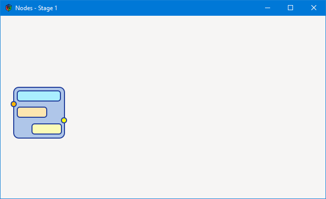
Using a Button was appropriate for Corkboard because an index card is rectangular and, well… so is a Button. But for nodes-n-noodles, a rectangle doesn’t quit do it. Going by what other applications are doing with this type of thing, we need a rectangular-ish widget, but with terminals sticking out the sides and, what the heck, let’s give the node rounded corners for that 1950s refrigerator look. The drawing to the right is the end result we’re aiming for.
I tried to produce the node using an Image on a Button, but getting rid of the Button’s rectangular border is far more trouble than it’s worth. And leaving it there spoiled the look. So instead, I used a DrawingArea.
Yup, that’s right. A DrawingArea—because it’s a full-fledged Widget—can do just about anything a Button can do. And if it doesn’t, you can expand its capabilities by adding more signal flags. And best of all, the final look of the node can be whatever shape suits the job at hand.
A Working Surface
In that long-ago version of Corkboard, I used a Layout as the corkboard. The advantages to using a Layout are:
- child widgets can be
put()in specific places rather than being at the mercy of widget flow as they would be in—for instance—theBoxwidget, - the
Layoutinherits fromScrollableIT, so scrolling is part of its default functionality, and - widgets can be layered onto a
Layout, so it’s easy to have a backdrop behind whatever foreground widgets you wanna stick in there.
And, since the goal for nodes-n-noodles is more or less the same as it was for Corkboard, the Layout will suit quit well.
A Simple Node


All right, we’ve got our widget players, let’s bring them onstage. We’re going to have a Layout and on that Layout, we’ll have a Node. And since it’ll eventually be moveable, let’s call the class MoveableNode… something like this:
class MoveableNode : DrawingArea
{
	private:
	Surface _surface;
	string _imageFilename = "images/node.png";
	int _xOffset = 0, _yOffset = 0, _width, _height;
	GtkAllocation _size;

	public:
	this()
	{
		_surface = ImageSurface.createFromPng(_imageFilename);
		Pixbuf.getFileInfo(_imageFilename, _width, _height); // get the image size

		addOnDraw(&onDraw);
		addOnButtonPress(&doSomething);
		addOnButtonRelease(&doSomethingElse);

	} // this()


	bool onDraw(Scoped!Context context, Widget w)
	{
		context.setSourceSurface(_surface, _xOffset, _yOffset);
		getAllocation(_size);
		setSizeRequest(_width, _height);

		context.paint();

		return(true);

	} // onDraw()


	bool doSomething(Event e, Widget w)
	{
		writeln("down");

		return(true);

	} // doSomething()


	bool doSomethingElse(Event e, Widget w)
	{
		writeln("up");

		return(true);

	} // doSomethingElse()

} // class MoveableNode
Looking at the class preamble, you’ll notice the visualness of the Node is just an image we’re pulling in from a file.
And in the constructor, we use the image file to create a Surface and a Pixbuf. This is exactly what we did in one of the Cairo examples when we loaded and displayed a PNG.
As usual, the onDraw() function takes care of refresh so the drawing always looks the way it should.
For now, the addOnButtonPress() and addOnButtonRelease() callback functions are just placeholders. We’ll do something with those as we dig deeper into all this.
The NodeLayout
As mentioned, the surface where the MoveableNode lives is based on a Layout and looks like this:
class NodeLayout : Layout
{
	MoveableNode moveableNode;

	this()
	{
		super(null, null);
		setSizeRequest(640, 360); // has to be set so signals get through from child widgets

		moveableNode = new MoveableNode();
		put(moveableNode, 20, 140);

	} // this()

} // class NodeLayout
Because this is a simple demo with only one MoveableNode, it’s hard-coded. Later, we’ll get to a point where hard-coding goes out the window and we do as we did for Notebook tabs, creating and deleting MoveableNodes on the fly. But for now, this’ll do to illustrate the process so far.
Conclusion
And that, my friends, is all for this time. Next time, we’ll double back and look at the drawing code that created that node image because we might not want to rely on an image file external to our code on release day. And after we look at the code, we’ll dig into setting up draggable hot-spots and other such stuff.
See you next time.
Comments? Questions? Observations?
Did we miss a tidbit of information that would make this post even more informative? Let's talk about it in the comments.
- come on over to the D Language Forum and look for one of the gtkDcoding announcement posts,
- drop by the GtkD Forum,
- follow the link below to email me, or
- go to the gtkDcoding Facebook page.
You can also subscribe via RSS so you won't miss anything. Thank you very much for dropping by.
© Copyright 2025 Ron Tarrant
